The Problem
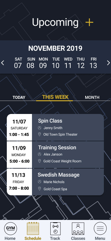
Currently navigation is a challenge and missing some important capabilities. It is not smooth to move between features, search classes on the schedule or book a personal training session.
The Solution
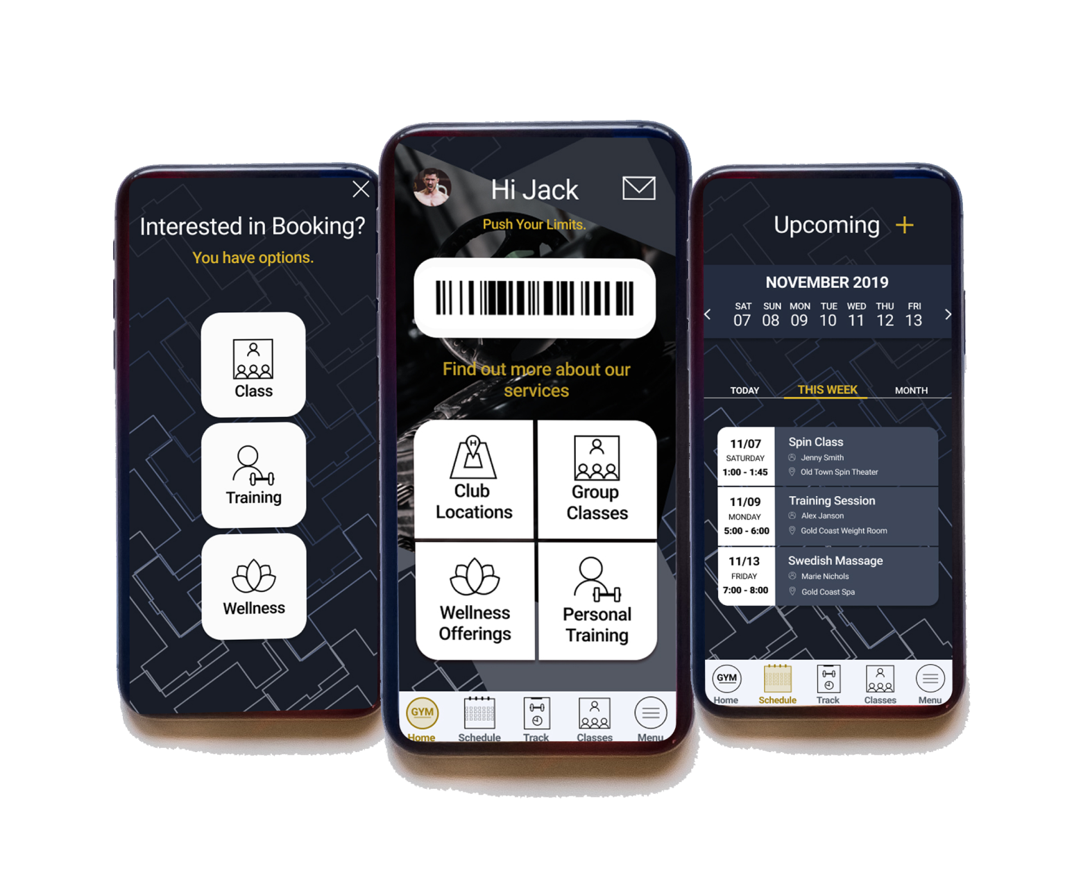
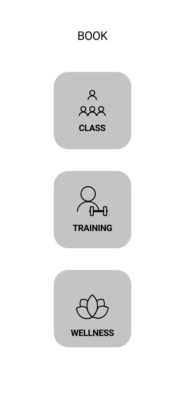
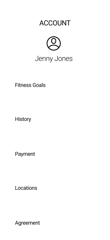
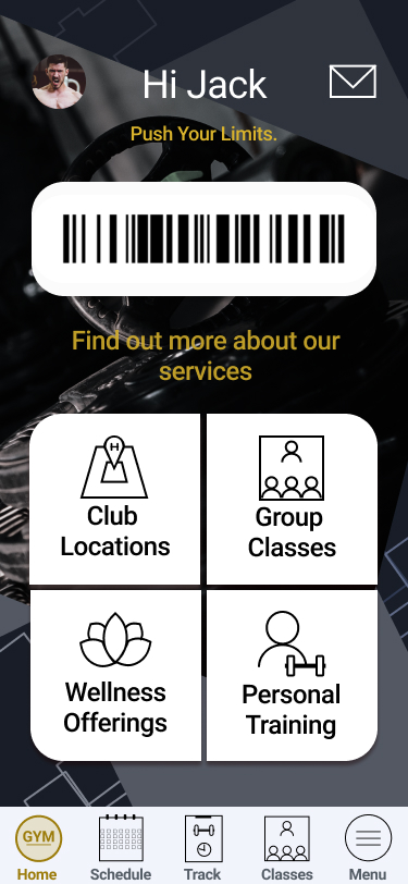
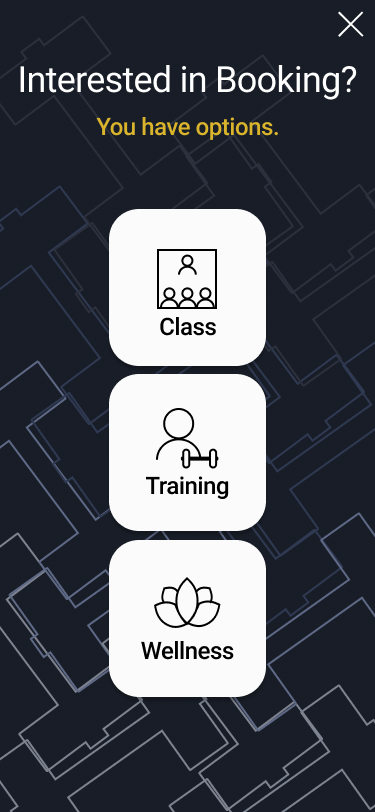
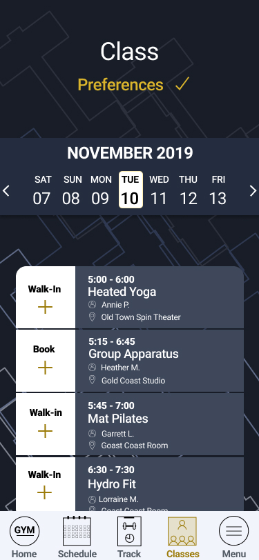
Screens were reorganized to enhance the key features. The bottom menu added buttons for easier navigation.
User Reasearch Takeaways
As a member of this gym, I interacted with the app and gym personally and used many of the gym offerings. This allowed me to closely understand the day to day needs of users.
Market Research
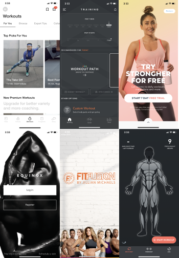
Reviewed Apps: Nike Training, FitBod, Shred. It was not possible to review competitors without being a gym member, so I found general fitness apps to get an overall feeling for the market. There are many great options, as the ones mentioned, to get a personalized workout and track your accomplishments. While this is not the goal of the redesign, it would be great to explore for an additional feature of the gym app.
The gym has a wide range of users.
A closer examination of a targeted type of the app user. Users demographics, motivations, goals and frustrations are explored. User personas are referred to throughout the design process to keep the product on track.
-

Jessica, 36
-

Edcucator
-

Friends, Dogs, Travel
-

Chicago, IL
“Working out makes me feel healthier and more focused.”
Motivations:
Career, Balance, Adventure
Goals:

She has great career goals, friends, and travel. Getting in shape, fitting into her clothes so she doesn’t need to buy new ones.
Needs:

Her schedule changes quarterly, so it’s good to have a calendar to keep track and make a plan. She uses the classes and has a trainer to push herself.
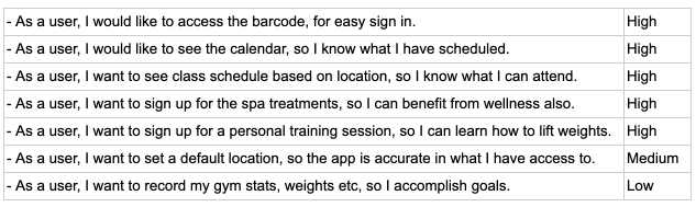
User Stories are determined based on users needs.
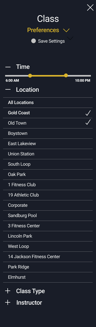
The top user stories highlight the importance of navigating through the app, searching classes and being able to sign up and create a schedule.
Wireframes showcase main user stories.
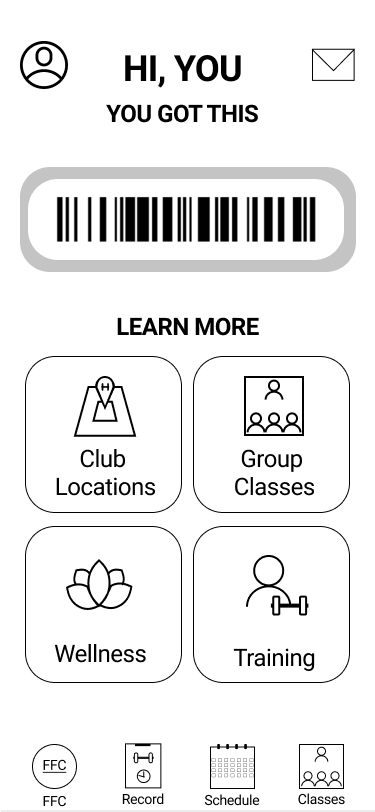
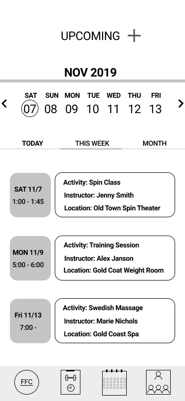
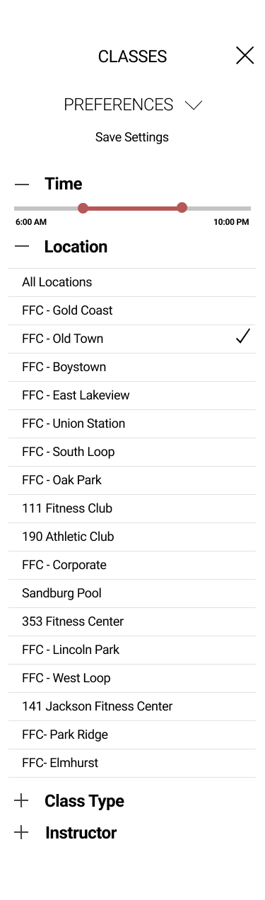
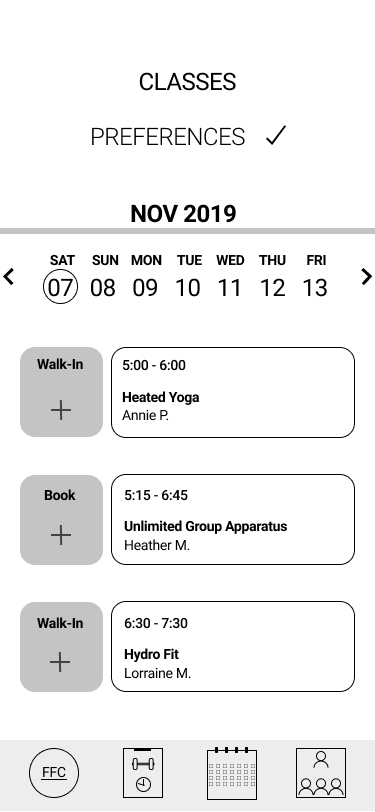
The wireframe focuses on the user stories of enabling easy navigation, filtering class options and creating a schedule.
Branding goal to keep app in line with established identity.
Competitor and market styles were also examined.

Color
The dark ground conveys a seriousiousness and focus to accomplishing goals, as well as being common in the market. The secondary color of gold enhances the olympic metal of accomplishments and action.

Typography
Roboto is used throughout, as it is an easy to read font and does not distract.

High Fidelity Mock-Ups
Iteration from wireframe to high fidelity mock-ups with images and color.